How to Write a Good Prompt: Media Style & Optics
Learn how to control lighting, framing, and film stock in your AI prompts.
This is Part 2 of the DEUTLI prompt guide. Before exploring lighting and optics, we strongly recommend reading Part 1: The Semantic Core to learn how to properly structure the subject, action, and environment of your scene.
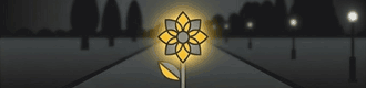
Rule 2: Don't type. Snap it in.
When we were creating DEUTLI, we pursued two main goals. The first is to make sure you do not miss a single important detail in the image structure. Yes, you will still have to type text to describe exactly what you want to generate (neural interfaces that directly read intentions are still in the development stage).
Our second goal is to reduce the time spent on routine to an absolute minimum. Instead of writing out the technical parameters of the scene over and over again, we developed a system of presets covering a significant number of working scenarios.
But that is not all. Based on knowledge in the field of visual arts, we broke down the technical parameters into groups that allow you to precisely control the viewer's attention. And yes, the proper staging of the shot is no less important than the description of the main object itself.
Let's move on to considering the technical parameters of the image that DEUTLI allows you to control.
ASPECT RATIO
The ratio of the width and height of the frame is a fundamental technical parameter that determines how the viewer will perceive the scene. A wide format (for example, 16:9) creates cinematic scale and is perfectly suited for capturing wide architectural exteriors or landscapes. A vertical format (9:16) is ideal for an accent on ceiling height in an interior and for mobile presentations, and the classic square (1:1) rigidly focuses attention on the central object or material pattern.
ASPECT RATIO
1:1
Square16:9
Cinema9:16
Social4:5
Portrait21:9
WideCustom
An important nuance: Not all generative neural networks allow you to set this parameter directly with text inside the query. For example, if Midjourney perfectly understands a built-in parameter (like --ar 16:9), then in various Stable Diffusion or DALL-E interfaces, separate buttons, sliders, or dropdown menus outside the text input field are often used to control proportions. Therefore, we strongly recommend studying the documentation for your neural network and its working interface.
However, even if your neural network requires setting the proportions with a slider manually, it is critically important to always fix the correct aspect ratio inside DEUTLI.
The thing is that your project is saved in a file of the standardized open format .deut. By saving the Aspect Ratio parameter in the structure of this file, you make it self-sufficient. This file becomes a full-fledged part of your future prompt library—the single source of truth about the shot. In the future, if you decide to transfer this query to another neural network that supports text parameters, or if you use an automated API scenario, the data about the proportions you conceived will not be lost and the system will automatically apply them correctly.
MEDIA STYLE
This parameter determines the very nature of the image — exactly how it would have been created in the physical or digital world. Choosing the right media style is the first step to managing expectations from the result, as it sets the baseline rules for the neural network for rendering materials and light. In DEUTLI we divided styles into three fundamental directions: Photo, Art, and Craft.
PHOTO
In this mode you force the neural network to work like a professional camera. The AI starts to strictly obey the laws of real optics, the physics of light, and the chemical properties of emulsions. The model focuses on the correct rendering of photorealistic textures (pores of the skin, grain of concrete, reflections on glass, the weave of fabric), micro-contrasts, and the realistic behavior of shadows. This style is perfectly suited for final architectural visualizations, creating interior mood boards, and any cases when you need to achieve maximum authenticity and a "documentary" look of the frame. DEUTLI offers three highly specialized directions within the PHOTO section that radically change the perception of the frame:
ART
An uncompromising choice for objects and scenes that do not require photo-realism. In this category, the neural network switches to the simulation of a graphics tablet, paints, or markers. This is the world of concept art, anime, and oil painting. If you need to express an emotion through brushwork, create a clean design concept, or work at the stage of searching for architectural form without detail, choose the ART style.
CRAFT
This style thinks in terms of physical material and tangible volume. Upon choosing CRAFT, the generator stops trying to imitate a photo camera and starts to simulate physical craft: sculpted clay, paper applique, or polished 3D render. It is characterized by high tactility, accentuated work with bevels, and a pleasant "toy-like" or artisanal character of objects. This is an excellent choice for infographics, UI/UX icons, and stylized layouts.
MEDIA STYLE
PHOTO
ART
CRAFT
CinematicDrama
AnalogVintage/Film
StudioClean
ProductComing in V1
Here it is important to note one of the key features of the DEUTLI interface — the cascading logic of parameters. After choosing the base MEDIA STYLE, all further sets of settings dynamically rebuild depending on your choice. If you chose Photo, the system will turn on the corresponding set of parameters, and you will speak with the neural network in the language of photography.
Inside the Photo style we offer three highly specialized directions that radically change the perception of the frame:
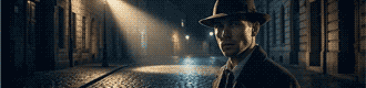
Cinematic
This style turns your generation into a frame from a high-budget movie. Its main feature is pronounced drama and storytelling. The neural network applies complex cinematic color correction (often using complementary schemes, such as teal and orange), deep, saturated shadows, and contrasting lighting. In this mode the scene looks massive and emotional. Excellent for creating atmospheric exteriors, architectural fantasies, or scenes with a strong mood.
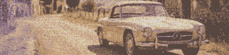
Analog
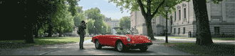
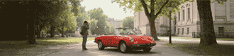
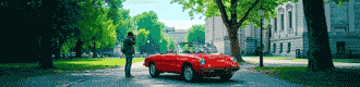
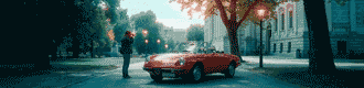
A style imitating shooting on a classic film camera. To force a digital neural network to spit out such a result, we force it to add physical "imperfections": noble film grain, soft vignetting at the edges of the lens, specific chemical color rendering of emulsions (in the spirit of old Kodak or Fujifilm films), and slight optical distortions. This gives the image a vintage quality, warmth, and a powerful feeling of documentary reality. Ideal for lifestyle shots, street photography, and creating an effect of "live" presence.
Studio
This is absolute control over the environment. This style emulates working in a professional photo studio with perfect, verified artificial lighting (softboxes, umbrellas, and directed flashes). It is characterized by flawless sharpness, clean colors, maximum elaboration of the smallest textures, and the absence of random light garbage. Studio is the number one choice for detailed subject (product) photography, visualization of materials, and creating perfect clean assets in design.
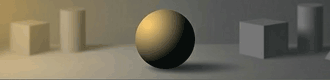
LIGHTING
When the base style is chosen, you can proceed to a more detailed description of the scene. The human visual apparatus can perceive the surrounding world only in the case of the presence in it of electromagnetic radiation in a certain range of wavelengths. Hmm... sounds too scientific. In essence, it's just light.
Yes, it's just light. But exactly what character it has determines how we perceive the surrounding reality. The scattered lighting of a foggy morning sets one mood, the hard light of the midday sun—a completely different one, and the neon lights of a night city—a third. Light is the main tool for controlling the atmosphere and volume in the frame.
So as not to search for words every time and not to type long descriptions of the lighting character manually, we prepared 5 verified presets in the LIGHTING category:
LIGHTING
SOFTDiffused / Overcast
HARDHigh Contrast
RIMBacklight
VOLUMETRICGod Rays
NEONVibrant dual-tone lighting
Soft
Scattered, enveloping lighting. It fills the space evenly, smoothing out textures and practically depriving the scene of deep, sharp shadows. This is the light of an overcast day or a studio softbox. Perfectly suited for creating a calm, pacified mood, even lighting of interiors, or portraits where it is important to avoid hard contrasts on the face.
Hard
Direct, directed, and uncompromising. It creates high contrast and casts sharp, deep shadows with clear boundaries. This is the light of the bright midday sun on a cloudless day or a narrowly directed theatrical spotlight. Hard light brilliantly emphasizes the texture of materials (concrete, stone, wood) and adds graphic quality and drama to the frame.
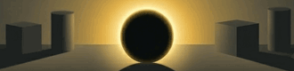
Rim
The light source is located behind the main object, shining right into the camera or at an angle to it. As a result, a bright, glowing contour forms around the silhouette of the object. This trick (often called back-light) instantly tears the subject off the background, giving the scene incredible depth, a cinematic feel, and mystery.
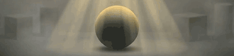
Volumetric
That very effect that photographers often call "God rays." Light becomes physically tangible thanks to the fact that it passes through atmospheric suspension — fog, smoke, steam, or dust in the air. You see clear light pillars breaking through the foliage of trees or falling from a window into a dark room. This is the most powerful preset for creating an epic, mystical, or deeply atmospheric scene.
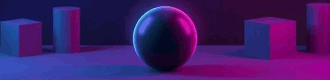
Neon
Artificial, saturated, and colored lighting. Unlike natural sources, neon works with open, screaming colors (pure purple, blue). It floods objects with colored reflexes, changing their true shade. The ideal choice for creating night urban scenes, cyberpunk, club atmosphere, or bright, modern accents in design.
FRAMING
God created man with a certain set of physical properties. For example, the best sprint runners are capable of developing a speed up to 44 km/h on a short distance of 100 meters. A marathon runner runs at an average speed of about 21 km/h, overcoming a distance of 42,195 meters. To move in space faster and further than our physical limits, we first saddled horses, and then invented cars, airplanes, and rockets.
With vision the situation is similar. A normal angle of view (however, studies show that this parameter is synthetic, since a person constantly scans the space with a glance, and the brain glues a panorama from hundreds of image fragments) can be described as one that allows you to see the interlocutor from head to waist at a distance that slightly exceeds personal space—about two meters. In a camera, such an angle of view is provided by a 40–50 mm lens on a "full" frame 36×24 mm, it is called exactly that—"normal."
Other angles of view are still unusual for a human. That is exactly why stepping away from the "normal" angle allows you to break out of the framework of everyday life and causes a powerful emotional response from the viewer. To structure the control of this optical tool, we highlighted 5 key presets:
FRAMING
WIDE
Wide Angle
STREET
Scene
PORTRAIT
Portrait
TELE
Zoom
AERIAL
From Above
Wide
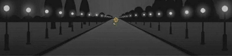
Captures a maximum of space. This preset visually distances the background from the foreground, making objects up close large, and the perspective itself — very deep and emphasized. This is an irreplaceable choice for the visualization of massive architecture or landscapes. And for the demonstration of loneliness, isolation, and the confrontation of man and the surrounding space.
Street
A field of view that is close to the normal perception of the human eye. It preserves the usual proportions between the object and the background, but since the angle of view is slightly larger, the background plays a significant role in the image, allowing you to unfold the plot by telling the story of the subject through its environment. This is the golden standard for street shooting, documentary scenes, and honest storytelling.
Portrait
A slightly narrowed field of view. This preset allows you to neatly focus on the main character or a piece of furniture, keeping the correct proportions of the face and geometry without the "bulging" distortions inherent to a wide angle. The subject starts to dominate over the background, clearly showing that the story is exactly about them.
Tele
A very narrow field of view, like when looking through a spyglass. Its main artistic feature is the strong compression of perspective. Space seems flat, and the background visually "sticks" closely to the main object. Perfectly suited for snatching out distant details and creating dense, graphic compositions.
Aerial
This preset stands apart, as it sets not only the field of view, but also a specific angle. This is a look strictly from above or at an angle, an imitation of shooting from a drone. As a rule, such a generation implies a very wide picture, allowing you to encompass the urban planning context, the master plan of a plot, or a large-scale landscape from a bird's-eye view.
The second most important tool for controlling the viewer's attention is also working with the subject/background ratio. But if the field of view controls it through scale (in fact, through the ratio of the area that the subject occupies to the area of the frame as a whole), then here we control attention through the difference in detailing.
The human eye physiologically catches on the sharpest and most contrasting place in the field of view. If you need to maximally highlight the subject, it must be sharp and full of small details, while the background is optically blurred, turning into color spots.
FOCUS
In DEUTLI, the FOCUS parameter group is responsible for this aspect. We reduced this complex physical process to three understandable presets:
FOCUS
ISOLATED
Shallow DoF
DEEP
Infinite Focus
SOFT
Dreamy Glow
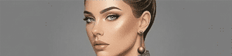
Isolated
This is a shallow depth of field. The main object is absolutely sharp, and the entire background is heavily blurred, forming a soft optical bokeh. In this mode, the viewer physically cannot focus their gaze on anything except the subject. This is an uncompromising choice for portraits, macro photography, product design, and any situations when you need to surgically accurately cut out the main object from a chaotic or distracting environment. Imitation of shooting with a maximally open aperture.
Deep
Infinite sharpness. Both the foreground, the main subject, and the horizon line right up to the most distant objects are in absolute focus. Every detail of the scene is drawn equally clearly and has equal visual weight. This is the golden standard for architectural visualization, interiors, large-scale landscapes, and complex scenes where the spatial context is no less important than the object itself. Imitation of shooting with a maximally closed aperture.
Soft
A specific artistic trick that works differently. Instead of a hard separation of plans, the entire image softens slightly, intentionally losing razor sharpness and micro-contrast. The contours of objects become slightly velvety, and around light areas a light glow can appear. This preset works perfectly for stylization under vintage optics, creating a fairytale, romantic, or dreamlike atmosphere, where excessive technical sharpness would only destroy the magic of the frame. Imitation of shooting with an optical softening filter.
FILM STOCK
Before proceeding to the list of presets, it is important to answer a frequent question: how does the Film Stock parameter differ from the Analog style that we chose at the very beginning (in Media Style)?
The difference is fundamental.
Media Style: Analog is a macro-setting. It tells the neural network: "Behave like an old film camera." It turns on global physical imperfections — vignetting, overall softness of the optics, slight wear.
Film Stock is a micro-setting, the specific "chemistry." It is the answer to the question: what exact coil of film (or sensor) is installed in your virtual camera?
You can choose the Studio style (with perfect light and razor sharpness) and apply the Portra 400 profile to it to get a clean advertising picture with warm film colors. And you can choose the Analog style and load TRI-X 400 into it to create a hard, grainy retro-documentary shot. Film Stock controls exclusively the coloristics, contrast, and grain structure.
FILM STOCK
STANDARDDigital / Clean
PORTRA 400Natural Color
VELVIA 50Vivid Slide
CINESTILL800T / Halation
TRI-X 400B&W Contrast
KODACHROMEComing in V1
We laid down 5 profiles into DEUTLI that neural networks understand flawlessly:
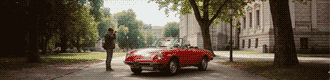
Standard
The default state of a modern digital sensor. Clean, neutral colors, maximum dynamic range (details are visible both in deep shadows and in bright lights), and the complete absence of artificial grain. This is the choice for technical visualization, where the color of materials must be conveyed as authentically as possible and without impurities.
Portra 400
Imitation of the legendary film from Kodak. Its superpower is the incredibly accurate, natural, and warm rendering of skin tones (skintones). It possesses lowered contrast, because of which the picture looks soft, slightly pastel, and very cozy. An ideal choice for portraits, lifestyle, and daytime interiors.
Velvia 50
The cult positive (slide) film from Fujifilm. The complete opposite of Portra. Velvia gives out extremely saturated colors (especially explosive red and green shades), high contrast, and deep, dense shadows. This is the absolute king of landscape photography, exteriors, and any scenes where maximum juiciness and drama of color is required.
Cinestill
A specific cinema film adapted for photo cameras. Its main visual gimmick, which neural networks adore, is halation. Around all bright light sources in the frame (light bulbs, neon signs, headlights) a characteristic red-orange glow forms. At the same time, the shadows go into cold, bluish tones. An uncompromising choice for cyberpunk, night street, and cinematic scenes in weak lighting.
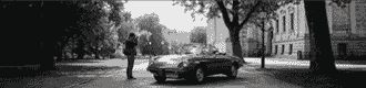
TRI-X 400
Classic black and white film. Unlike the simple desaturation of a picture in a photo editor, the TRI-X profile forces the neural network to think in volumes and shapes. This preset gives a deep, dramatic tonal contrast between black and white, and also adds expressive, large film grain. Works excellently for architectural abstraction, dramatic portraits, and reportage stylistics.
But the creative process does not stop at photography. The final part of our guide is divided into two distinct sections. You can explore them sequentially or jump straight to the topic you need right now:Beyond Realism: Art & Craft Styles — Master digital painting, anime, oil, and tangible 3D or papercut renders.The Engine: Advanced Settings & Prompt Generation — Learn how to use visual references, fix the mathematical noise, and how the "Generate Prompt" button crystallizes your intent into a working formula.
Stop typing. Start snapping.
You know the theory. Now put it into practice. Build your first structured visual formula in seconds and export your .deut file.